With the impending launch of my new enterprise, it’s time to get down to the business of creating a logo. This article will document the process, good or bad, success for fail, the steps I take will be detailed here for your amusement, edification or horror. You be the judge.
STEP 1 – Get the idea formulated.
Get get started, sketch out a general idea for the logo. Since this I am still a pre-launch state, that drawing will remain a work of the readers imagination. I will tell you though, that after a few iterations I knew what I wanted to go after, and what base information I needed.
First I decided that one of the components I needed for this logo project was an image of the crescent moon. This was of course very easy to locate on the web. There is no lack of such images.
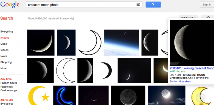
I decided on a sampling of the images and saved them off to a special directory on my computer. Now it was time to step away for a few minutes, clear my mind and and prejudices regarding the images, and then re-open the directory and look at each one. After some time, I selected one of the images that seemed to have the most promise.
Now, it’s important to NOT get locked in or bogged down on one image. Don’t shoot for perfection here, you must be comfortable with the concept that your first, seconds, or maybe even your fifth attempt will be abject failure. It’s a process, and if it will take you 5 attempts to get it right, you’ll never get there unless you get through those first four… so.. let’s get to it.
Step 2 – Open and adjust image to suit
Select your first best guess as a starting point and open the image in some photo editing software. My choice is Photoshop:
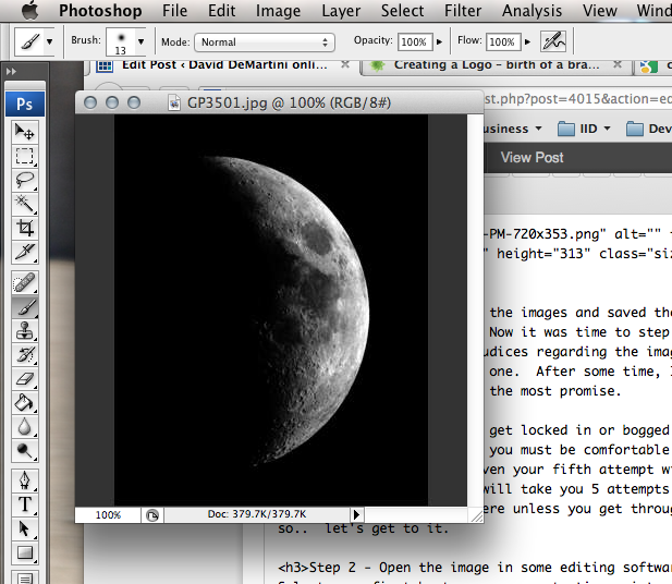
The goal I have in mind, requires the crescent to be on the other side of the logo, and the curve must extend over the top. So, this image as is, will not do. Opening up a variety of Photoshop tools (at this point I should point out this is NOT going to be tutorial on how to use photoshop, there are plenty of those done by people better than I at providing such help), I flipped the image and rotated it clockwise 22 degrees.
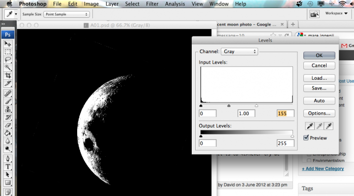
The next step was to then upon up the ‘Levels’ tool and start cranking in as much contrast, at both the white and black ends of the scale, to remove as much detail as I felt practical. This is needed to get the image close to something you can work with then we open this up again in vector editing suite. This will hopefully make sense, shortly.
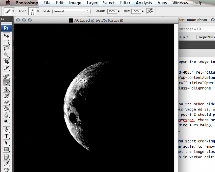
This is when things start to get tricky. I know that I may need to go back to photoshop and crank in more contract, or maybe I need to change which end of the contrasting I apply to get just the right amount needed when I move to Illustrator and start my vector editing. Take a few moments to look at your image, if you are attempting something yourself, and apply any tweaks you feel you need now. You’ll notice the file name has changed. I like to keep a good clean copy of the original files aside in case I really destroy the current version. Hitting the “reset button” is more likely to happen than not. Don’t get discouraged if you have to start over. It’s better to have tried and failed than to have never tried at all, simply because you’re afraid to fail. The only way to completely fail is to never try at all.. Be a DOER… not a WISH I DIDer! Here I am making a few more adjustments.
STEP 3 – Open in vector editor
Now, it’s time to find out if I did enough contrast adjustment. This is also the point when I find out if I have a clue what I’m going in Illustrator. caveat emptor, you’re getting what you paid for here.
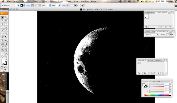
Now, before doing anything, I’m going to save the workspace. Again, it’s nice to be able to get back to the beginning if something goes wrong.
Next step I want to increase the size of the workspace into roughly a 2×9 ratio (height x width). This will give me room for the next parts of the logo, including text etc., and finally used one of the built in tools called “Live Trace” to convert the image into an Illustrator vector:
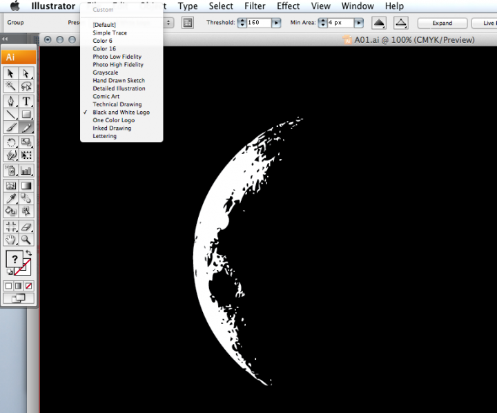
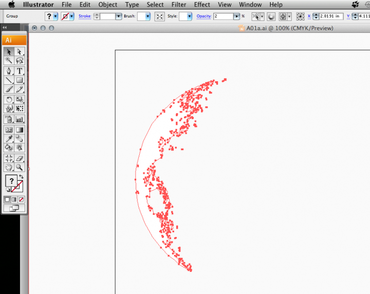
Here is what the resulting vector nodes look like once the trace is complete. I adjusted the minimum pixel and path size vars up and down until I had a trace I liked.
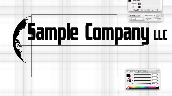
After inverting the image, using live trace and use the ‘Auto convert to Live Paint, I had the primary image I wanted. Following the conversion, I added a target and underline, then selected a text I wanted to use. Again, I’m not totally in love with this text and I way decide to change this later, but for now, to test this image, I have to start somewhere. Of course, Sample Company is *not* the name I’m going to be using, this is just that, a sample. After about 3 hours of work, mostly poking around in Illustrator for the options I really wanted to use I have this concept proof.
Step 4 – wrapping things up
Once the new image is saved, make sure cropping is properly set and export the image to the apps you need. For me, I needed it in a transparent .png for use with invoices, letterheads and publishing.
This is just the beginning. Once the new company is fully launched I’ll be posting the final logos. Keep an eye out for more news on Jun 18th!